


Think, make, check—these are the principles of lean ux and are what guide my process in finding problems and solving for them. The following are just some examples of that in action.
When a JIRA ticket comes in requesting a design solution for a problem, my first instinct is always to 1) confirm that it’s an actual problem and 2) determine if it’s a problem that warrants a solution elsewhere. Low conversion rate on the home page? Gurl, are you sure it isn’t because of the content? 👀
Users didn’t know how many items were in a collection. To prevent cluttering the UI with more static elements (e.g. item counter), I relied on visual cues instead and opted for a convention already familiar to users on mobile web browsers: a transient scroll indicator.
The concept of price protection is simple, but explaining it simply is anything but. I burned a lot of calories thinking about how to visually educate the user not just about what price protection is, but how it works with Earny.
There was no visual feedback letting users know when a stream was loading upon acting on a cta, leaving them with some anxiety as to whether the app was working. Instead of specifying with unwieldy network and show logos what stream was being loaded, I went with system text and a spinner over the player.
As a way to improve education, we wanted to test having an inbox analysis animation after the user connects their inbox during onboarding that would accomplish two goals: 1) reassure the user that we’re working right away and 2) educate the user about the process (and, implicitly, the value props).
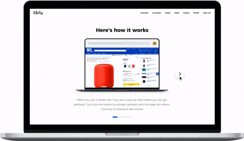
Knowing how impactful education is to the user experience, we wanted to make sure new users understood how cashback works with our Chrome extension. Taking our learnings from our app onboarding carousel, I applied the same concept here. This gives us an opportunity to set expectations, demystify what actually happens when a user activates cashback, and be transparent about how the user and Earny gets paid.
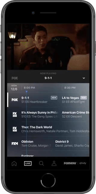
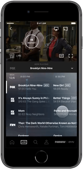
Since we went with an epg layout for the live section, we needed to account for keeping program titles in view while the user scrolls horizontally for the use case of long programs that spanned several increments of cells. My solution was to simply pin the metadata to the left of the cell and have it scroll out of view when the end of the program entered the viewport.
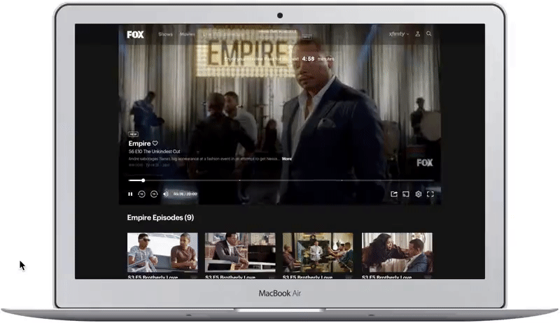
We needed to accommodate preview pass functionality on the web player page. The objective is to let the user watch content without obstruction, so I wanted to minimize the distraction of the persistent counter and only show a cta when the user interacts with the UI.
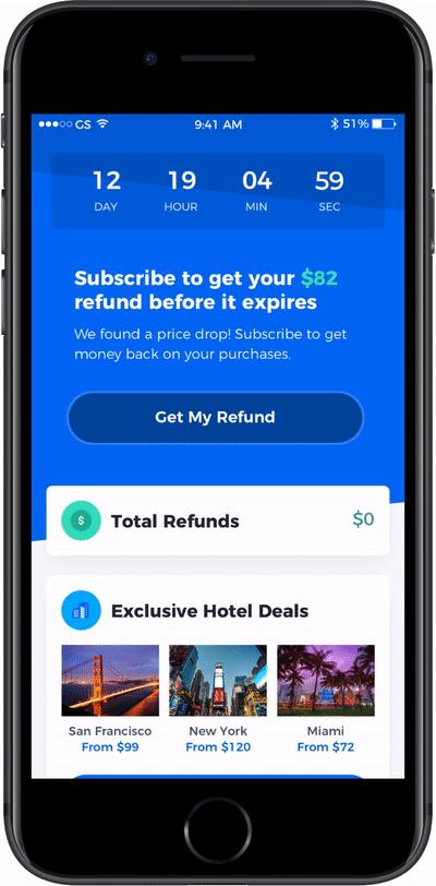
We wanted to test different kinds of FOMO to upsell users on subscription, one of them being a price drop that we find on a user’s purchase. Adding a timer reinforces urgency and a subtle pulsation of the button gently nudges the user to take action.
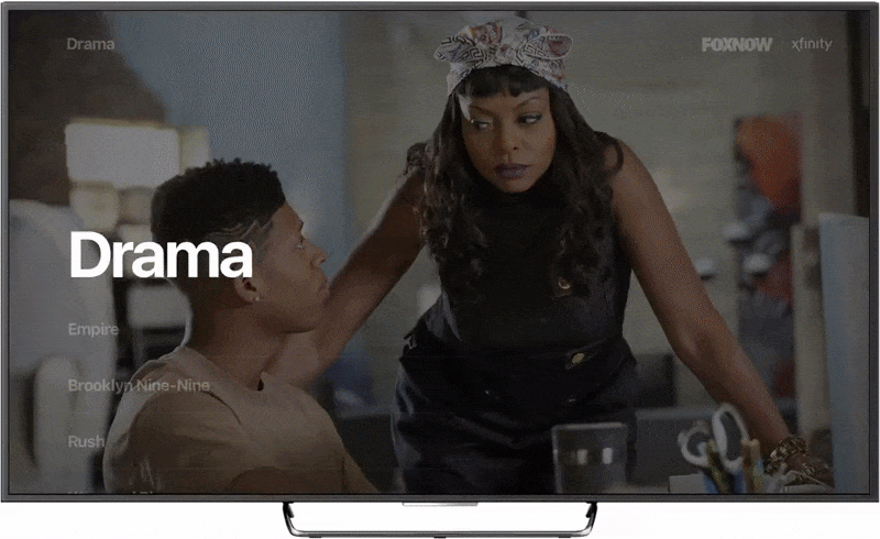
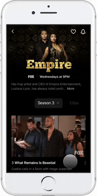
Keeping the focus on video starts on these pages, I wanted to make the browsing intuitive, but also more interesting than just a static content list. So, I separated the series logo and key art to create some depth and visual interest as the user scrolls while keeping the navigation simple and in the forefront.